As the SaaS market grows and competition heats up, branding becomes a must for every player. Remember, many SaaS companies provide similar software solutions. The only way to stand out is to communicate your value effectively through branding.
A logo might seem so small, but the instant recognition it gives your SaaS products makes it one of the most important aspects of your branding. However, it’s not enough to design a good-looking logo. To get it right, your logo should reflect your brand’s goals, values, and positioning!
First Impression Matters in Branding!
Your logo is often the first thing people see about your brand. It gives your business a “face” that shows what it is about (or appears to be about). Is it trustworthy? Is it organized? How reliable is it?
A good logo can grab attention and make people want to know more about your brand. For example, if your logo looks clean and modern, it gives your software a user-friendly and professional look. When you give the logo a bold, unique, and colorful look, it associates your brand with creativity.
On the other hand, a bad logo can give the wrong impression. If it’s confusing or hard to read, it might make your brand seem disorganized. And if it looks too plain or generic, it can suggest your brand isn’t unique.
These first impressions can be crucial in the SaaS space, where players are looking for effective solutions. Your logo, being more than just a design, is your chance to make a good first impression that makes people try your product.
9 Best Practices for Designing Your SaaS Logo
1. Dig Deep to Understand Your Brand Identity
Before designing a logo, you need to know the market you want to “own.” Your competitor’s logos can be a source of inspiration, but then think about how your logo can be different. You also need to research what your audience likes and expects from your brand so your logo can connect with them.
Your competitor and audience research will help shape your brand identity. But to get to a concrete identity, you need to answer these questions:
- What’s your mission? What is the main purpose of your SaaS product? This will help you design a logo that reflects your brand’s goals.
- What are your core values? If your brand values innovation or security, your logo should convey that feeling.
- What makes you different? What sets your product apart—advanced features, ease of use, or a focus on data privacy? Your logo should capture that.
When you have these answers, you can design a logo that looks good and represents what your brand is all about. This helps customers connect with your brand and remember you for the right reasons.
2. Choose a Logo Type
Based on your research, try out different logo styles to see what fits your brand. SaaS companies often use:
Wordmarks (Just Text): A wordmark is a text-only logo created with a custom font to stand out. It’s a good choice if you want a clean and professional look. For example, Google uses wordmarks to keep its logo simple and recognizable.
Pictorial Marks (Simple Icons): A pictorial mark logo is an image reduced to its most symbolic meaning (often without text) to represent a brand. This type works well if you want an image that quickly conveys what your product does. Twitter’s bird is a good example of a memorable pictorial mark logo that ties directly to the brand.
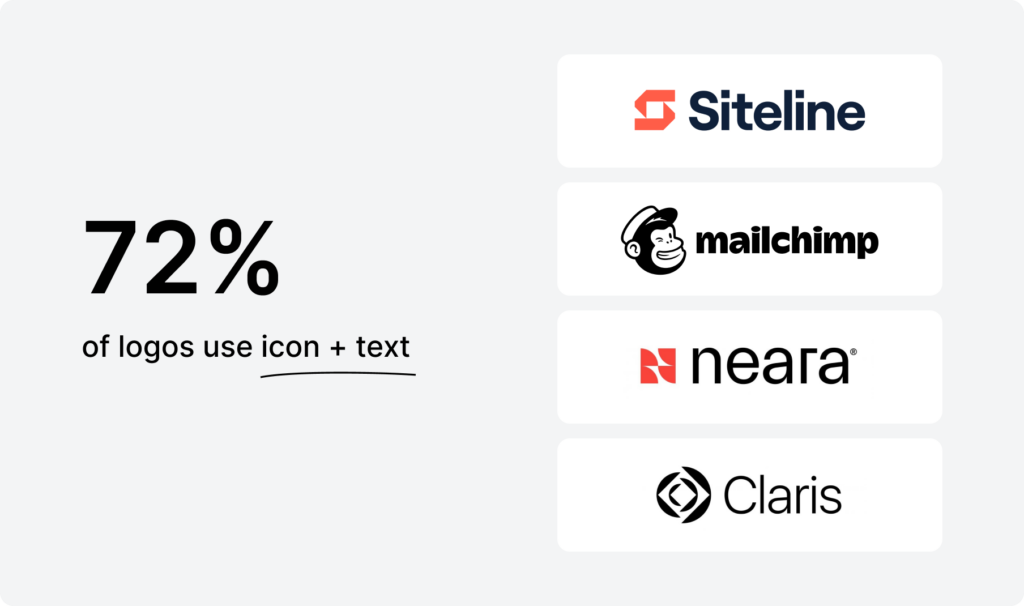
Combination Marks (Text + Icon): A combination mark uses text and an icon to give you flexibility in different situations. You can use the full logo in larger spaces or just the icon where you need a smaller version. Shopify and HubSpot use this style to adapt their logos across platforms.
3. Pick the Right Colors
Color choice is critical in designing a SaaS logo as it determines how customers perceive your brand at first glance. Each color can subtly convey your brand values and where you fit in the industry.
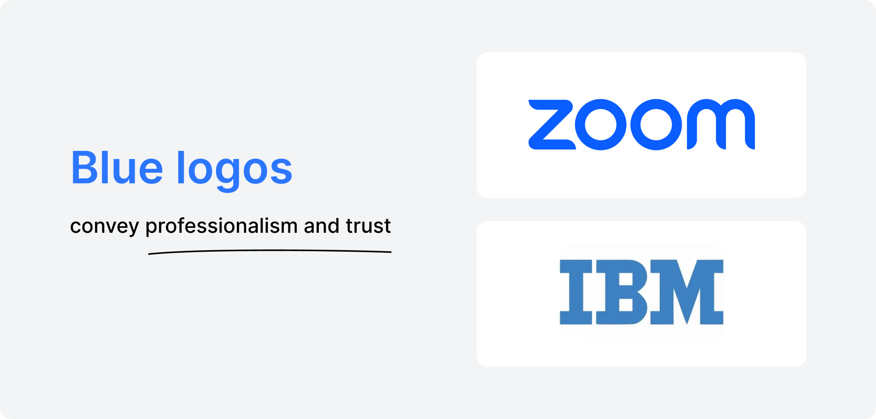
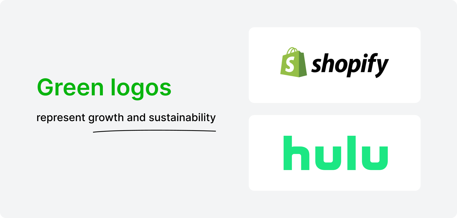
IBM and Zoom, for example, use blue logos to convey professionalism and trust, while Spotify and Hulu use green logos to represent growth and sustainability.
When designing your SaaS logo, it’s a good idea to use fewer color combinations. A limited palette looks cleaner, more professional, and easier to recognize. Too many colors can look cluttered or confusing, but a simple color scheme keeps the focus on your brand.
Most importantly, choose colors that fit your brand personality and the message you want to pass.
4. Use a Modern and Readable Font
SaaS companies operate largely on digital platforms and, as such, require fonts that can be easily read and look good in different sizes. Your logo will be on everything, from app icons to website headers, so the font should work well across different screen sizes and formats.
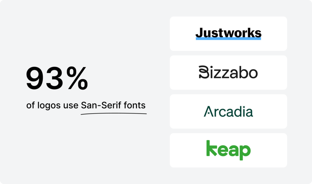
Modern and minimal fonts are generally the best choice for SaaS logos. One example is the Sans-serif fonts, which are quite pohttps://font.download/font/helvetica-255#google_vignettepular for their clean, simple look that feels professional and uncluttered. Fonts like Helvetica, Arial, and Open Sans are also widely used because they are easy to read on large and small screens.
When choosing a font, think about how it represents your brand. For example if your SaaS product simplifies tasks or streamlines processes a clean and simple sans-serif font can reinforce that sense of clarity.
Finally, test your font at different sizes. The ideal font should be as readable and impactful on mobile as on desktop. This way, your logo will be recognizable and effective across platforms and will strengthen your brand consistency and identity.
5. Keep It Simple and Scalable
A simple logo brings about a brand easily recognized on any platform. When your logo is simple, it leaves a lasting impression. This is crucial in a competitive SaaS space where people scroll fast and make quick judgments.
A simple logo also resizes well and is easier to adapt to many platforms—your website, mobile apps, social media profiles, and smaller spaces like email signatures or app icons.
Avoid using too many details, as they can get blurry when the logo is scaled down. Clean lines, basic shapes, and minimal elements help keep your logo looking professional everywhere it appears.
6. Test the Logo Across Platforms
Your logo will be in many places, so you have to test it across different formats and screen sizes. Create variations if needed:
- A full logo for website and presentations.
- A simplified icon for app icons or social media.
Remember to get feedback from users or team members before finalizing the design.
7. Refine and Protect Your Logo
After gathering feedback, make any necessary refinements to ensure your logo looks good and sits well with your brand’s values.
Once satisfied, lock down the logo by registering it as a trademark. Trademarking legally protects your brand identity and prevents competitors from using a similar logo that can confuse customers or dilute your brand.
8. Be Timeless, Not Trendy
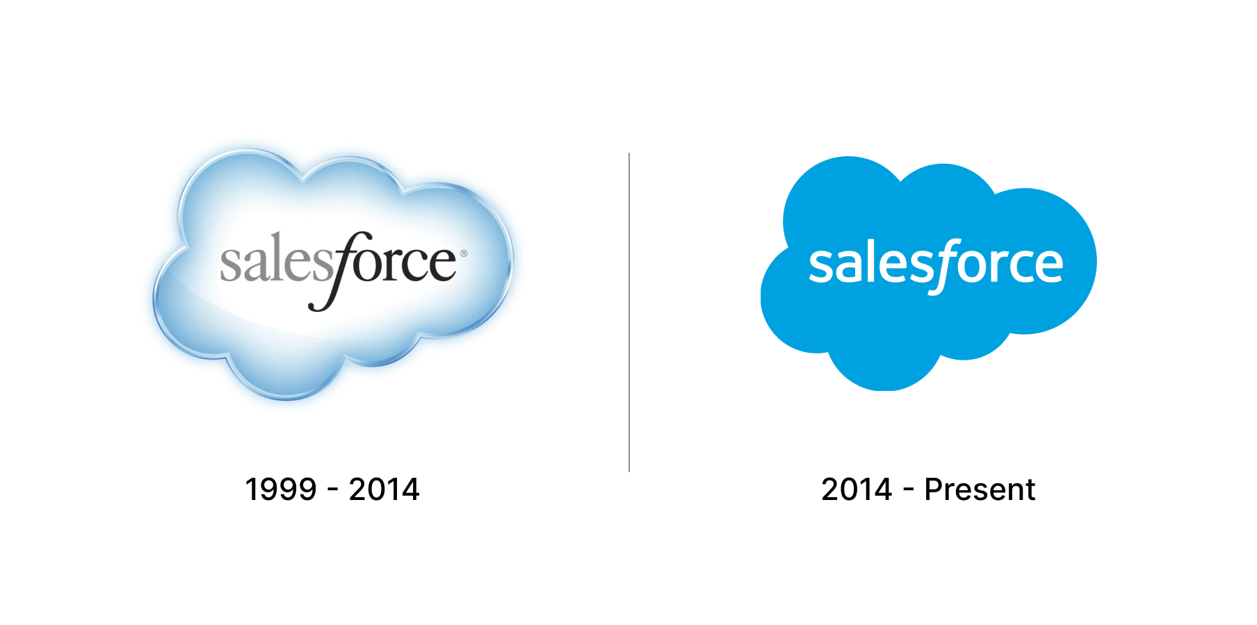
Trends change fast, but a solid, well-thought-out logo becomes a brand’s long-term visual anchor. This longevity is key for a SaaS company that wants to build familiarity and trust with users over time—something you can’t achieve by following trends.
Salesforce, for example, has kept their logo simple and clean. Instead of following trends, they have always focused on clean shapes and colors that are easily recognizable and adaptable to many uses. This has helped them maintain a consistent and recognizable brand identity over the years.
9. Get Professional Help If Needed
Designing a logo is a skill, so get help if necessary. Working with a designer who has experience in SaaS branding can ensure your logo is visually on point and meets industry standards. Contact Project Branding today to get professional branding solutions for your SaaS company.
